Fleet Assess
Overhauling a field assessment & reporting application for Fortune 500 turbo machinery player.
Using a modular design approach, I transformed the product from a purpose-built tool to a use-case agnostic field reporting application with improved user experience, streamlined architecture, data integrity, and more flexible report generation.
Project
Oil & Gas, Engineering, Enterprise
Role
Product Design, User Testing

Challenges
The application was originally built to serve a single use case. The user interface was designed with a limited scope in mind, with features and components lacking a clear, long-term vision. New business cases called for a reimagined, more modular, and user-friendly version of the app.
Usability was poor — workflows were confusing to most users and some UI elements such as buttons were disguised as tabs, icons, and text. This was a true Frankenstein project.
Another element of complexity here was the total absence of technical documentation and technical background, requiring extensive BA and engineering collaboration to backward-engineer the current use cases.
Research
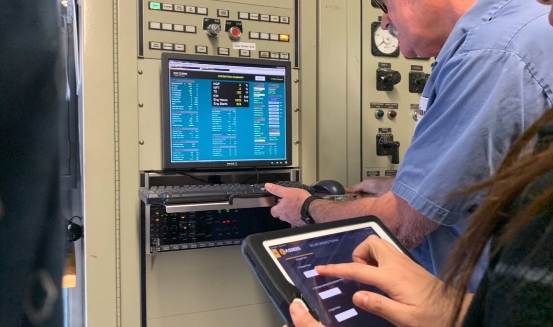
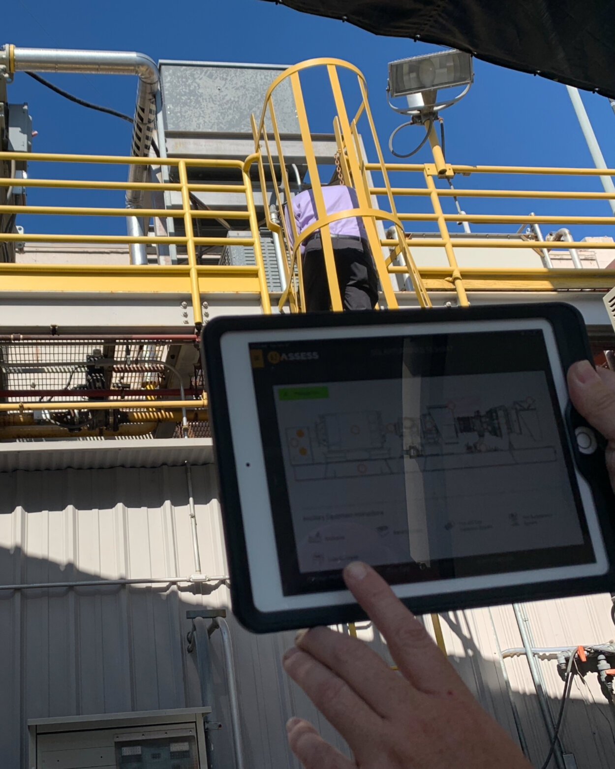
Because most of the user interactions happened at site, I conducted contextual interviews with end users in order to gather actionable design direction and gain user experience insights.
Insight
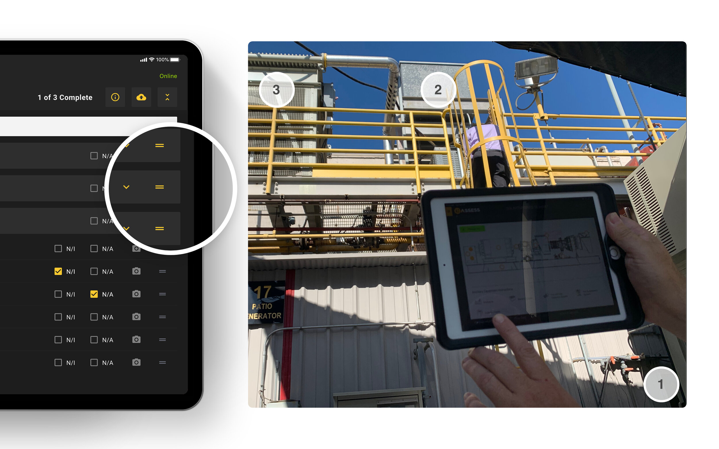
Assessment tasks in a fixed order was not compatible with the reality of performing an on-site inspection. Functionality could be optimized by allowing personnel to reorder tabular lists.

Component Audit
A thorough assessment of the values and benefits of each existing component would show what was still useful and what was not.

Findings
There were over 35 unique visual controls in the application. Some with overlapping functionality.
The user interface had the interaction properties of a website: small, buttons, dropdown lists, and tabs.
Prototypes & User Testing
I designed visual prototypes in order to obtain insights from stakeholders and end-user groups.

Findings
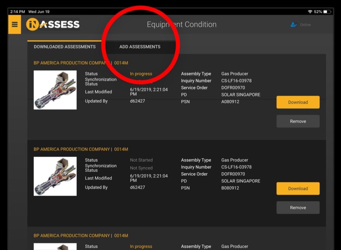
The majority of the end user work happens in the Assessment view, where engineers in the field fill out assessment data—forms, photos, gradings, etc.
A comparison of tabular to ‘card' data brought to light that the cards and thumbnails were too large and did not show enough records per view. Too much space was taken up on screen with little added benefit.

Improved Findability
Table layouts allow unlimited columns, making the application more scalable. It also facilitates sorting and reordering—giving control to the user.

Usability
The ability to reorder inspection points gives the user control to adapt to real-life conditions.
User Interface
I replaced images and hidden lists with a more transitional and well-understood “task list” workflow with clear indicators of status and completion.

Accessibility
Links, buttons, and other interactive components are positioned near the bottom left and right of the view, which allows a human holding a mobile device from the sides to use the application ergonomically.
